

Sapling’s Time Off product provides an intuitive way for HR teams to track time off across different locations. Launching this allowed Sapling to enter a new market (Core HR Software for the mid-market), and has contributed to a 40% increase in annual recurring revenue.
When I joined, Sapling had one product they were selling-- an employee onboarding tool. HR admins would import new hires from an applicant tracking system, such as Lever or Greenhouse, and onboard them in Sapling. They could allocate tasks and documents for them to sign, and employees would use Sapling to learn about their team members, and to fill out forms.

Highlights:
There was a signficant need from potential and existing customers

Prior to starting any mockups, I carved out one sprint (2 weeks) of focused time for a few research activities, ranging from a diary study to user interviews.

On a broader level, I partnered directly with Sapling's CEO and Head of Sales to run some churn-analysis to understand the financial impact of selling this new feature. This helped quantify the impact of design's role, and also gave us a clear success metric to aim for. The competitive analysis I completed include both a feature matrix sheet and a UX teardown in Figma. The user interviews and diary study helped us better understand long term behavior and needs from our current customers. These helped us collect quantitative data on our user's current workflow, and the desired outcomes they have long term.

I gave myself about a month to finalize designs prior to handing them over to engineering. This includes several levels of fidelity: a basic flowchart in LucidChart, low-fidelity mockups in Balsamiq and a Figma prototype. There are three distinct target audiences for this product, so each design artifact was refined for each user type.
My user flow ended looking like a mess, so I organized it through a site map. This helped me think through the layers of the app, organizing my primary and secondary navigation bars. An anchored tab bar seemed best to jump between sections of the app.
Keeping with the warm, neighborhood theme, I searched for a font that reminded me of my own hometown of San Jose. San Jose is your typical sunny suburb. I spent most weekends from April through September at the beach nearby, and wanted to somehow bring that into the logo. Pacifico is a bold, bush script that still looks very modern. Using this once in the logo and app icon will make it memorable.
Bariol is used as the primary type for the app. It’s a slightly condensed serif that is still modern for a mobile app. The rounded type complements the logo.


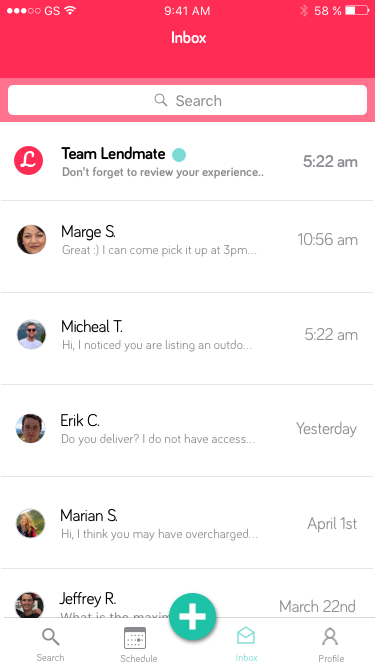
As I converted everything to high fidelity, I realized that messages wouldn’t be the best way to track/manage all of a user’s planned rentals. If a user has listed 30 items on the platform and on an average day half of them are being utilized by others, then it would be a nightmare to remember it all.
To solve this, I built a native calendar that would track all past, current and upcoming rentals.

For rating and reviews, I leveraged Usabilty Hub’s Preference test feature to help me a finalize where a user would add feedback for an item.


Once completely finished, I wanted to challenge myself a bit further by practicing some Guerilla Usability Testing at a busy park in San Francisco. I approached a few strangers, telling them about my project and asked for a few minutes of their time. Here are the results:
The feedback I received from these users, as well as my mentor was invaluable. Below is the final prototype (created with Marvel):
What went well?
On the business side, we quickly validated that we could earn more net new customers by adding HRIS features. Within the first 3 months of launch, this time off product attributed to 30% of new monthly recurring revenue. Having it in production also allowed us to prevent the churn of two major enterprise clients. You can read one of our customer spotlights on Sapling's website.
Additionally, I was proud that despite how small of a team we were at the time (one designer, 4 engineers, one PM), we still were able to leverage UX research at every major project. milestone. It was a great way to highlight the design process and to to build a customer-focused culture. Usability testing the designs early on using low fidelity wireframes enabled us to quickly throw out design concepts that were complex or confusing.
K
Our team made a few mistakes along the way, with the most obvious being that we severely under estimated the development work. We were a new team at the time and still hadn't implemented agile scrum practices, so there was tons of scope creep toward the end of the project that led us to delaying the project timeline. We also did not plan dedicated time for QA. The product went straight into the customer's hands, and the perception of product quality was poor due to the amount of discovered bugs in the product's first month.
What's Next?
Immediately following our initial product launch, we followed up with another release focused on fixing bugs and improving the time it takes to setup a time off policy.

