

Lendmate is a fictional iOS app that enables you to rent the things you need from people in your neighborhood. Users can quickly upload photos of rarely used items around their house (or in their garage) and set a daily rental price. Reservations and payments are all completed inside the app.
Every few years, when I decide to go camping with my friends, I find it hard to justify the costs of a new tent, and new equipment. I end up asking around my networks if I can borrow the items. Aside from outdoor goods, I ran into this problem recently when I needed a moving dolly (but again, did not feel like it was worth the purchase for something I would use one time). A platform like Lendmate was needed so I can quickly locate these items from people who already own them.
As a UX Designer, my involvement in this project included all stages of the design process: content strategy, information architecture, user research, UI design and most importantly, usability testing. I used the following tools to create a mobile app for iOS:
Early on in the research phase, I intended for Lendmate to be a borrowing app (rather than renting for cash). At its core, sharing unused items for free is one criteria of collaborative consumption. In a world of abundance, this model promotes people to interact with one another, feeling good that they helped a neighbor. The only problem with this is monetization. If borrowing items on this platform is free, how can we drive users to sign up and post their items? How can this compete with classifieds apps (Craigslist, Mercari, Letgo)?
Highlights:

Results showed that the majority of users rarely purchase expensive assets, and when they do get purchased, they aren’t used daily. Use tended to be seasonal. Unsurprisingly (not shown in the graph above), users were split when asked if they would trust a stranger with something valuable. This then led to the next few question-- what kinds of items should be posted on this platform, and how can I use crisp, in-app messaging to maintain user confidence?
To help answer these questions, I selected two respondents from the initial survey to interview. This revealed that users felt like they had too many belongings. One user mentioned that she makes an effort to donate excess stuff such as clothing or outdated electronics between 2 -3 times per year. Both users assumed that items they would offload were no longer valuable.
Both users also mentioned that if they ever needed something quite expensive (in my interview I mentioned a lawnmower), they would first go to a friend or family member. If they knew their neighbors, they wouldn’t mind asking them too, but both had never tried. Both users were very open to sharing items if someone needed it. Getting paid was preferred as a way to secure the condition.
Using this data, I put together two personas:


Creating these personas allowed me to focus needs and tasks that were driven by users themselves, rather than pulling from assumptions.
I also analyzed a few potential competitors. I created three large categories for comparison: business profile, borrower experience and lender experience. Using the results I received from my initial user survey, I then listed out a few necessary features under each category and compared the experience for each. Full analysis is done here.


I realized out of the three companies I chose, none were mobile first. Only one had an iOS app, but it had an extremely low user base in the United States, making it hard to look at real data. The opportunity for Lendmate is there.
At this point, I documented my feature requirements into stories, making the decision to continue as a renting app.

To keep the flow simple for this first version, I removed a few user stories for later versions (ability to request an item to be fulfilled, and the ability to block users). To outline the user flow of the onboarding and signup process, I referenced the UI for Mercari, a classifieds app that allows users to sell used clothing. Mercari allows you to browse items first before creating an account, which would later be important for this app to prevent any early dropoff.

My user flow ended looking like a mess, so I organized it through a site map. This helped me think through the layers of the app, organizing my primary and secondary navigation bars. An anchored tab bar seemed best to jump between sections of the app.

My user flow ended looking like a mess, so I organized it through a site map. This helped me think through the layers of the app, organizing my primary and secondary navigation bars. An anchored tab bar seemed best to jump between sections of the app.

Keeping with the warm, neighborhood theme, I searched for a font that reminded me of my own hometown of San Jose. San Jose is your typical sunny suburb. I spent most weekends from April through September at the beach nearby, and wanted to somehow bring that into the logo. Pacifico is a bold, bush script that still looks very modern. Using this once in the logo and app icon will make it memorable.
Bariol is used as the primary type for the app. It’s a slightly condensed serif that is still modern for a mobile app. The rounded type complements the logo.
The selected colors are bright and complimentary to create a playful effect that is still elegant. This palette proved to be flexible, allowing me to build payment forms as well as simple illustrations.


This ended up being quicker than I imagined thanks to my notes and user flows already being complete. The challenge was fitting the elements into that precious amount of iOS screen real estate. Particularly, I found the following areas to be challenging:
I wanted to tell the brand story through a simple tutorial at the user’s first download. Sign up options would be email or Facebook. I debated using Nextdoor as an alternate sign up, but decided against it for now until it grows internationally. In the bottom navigation, I highlighted the “add” icon by increasing its size and position. This is a new app, and we should make it as easy as possible to snap a photo of an item to post on the platform.
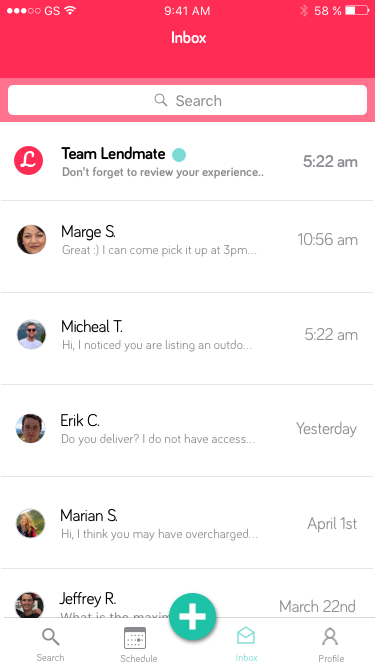
Another piece that was added during the wireframing phase was the “inbox” screen. This was a central place for users to manage all conversations. Prior to renting out an item, you may ask a question about it to a previous renter, or you may want to use that feature to set a meetup location. This could also be a central place for Lendmate to communicate to all its users in the app (versus email). Use-cases for this would be a feature announcement, or a promotion.
As I converted everything to high fidelity, I realized that messages wouldn’t be the best way to track/manage all of a user’s planned rentals. If a user has listed 30 items on the platform and on an average day half of them are being utilized by others, then it would be a nightmare to remember it all.
To solve this, I built a native calendar that would track all past, current and upcoming rentals.

For rating and reviews, I leveraged Usabilty Hub’s Preference test feature to help me a finalize where a user would add feedback for an item.


Once completely finished, I wanted to challenge myself a bit further by practicing some Guerilla Usability Testing at a busy park in San Francisco. I approached a few strangers, telling them about my project and asked for a few minutes of their time. Here are the results:
The feedback I received from these users, as well as my mentor was invaluable. Below is the final prototype (created with Marvel):
I’ve heard the term “feature creep” in previous jobs before, but it wasn’t until my role in this project that I felt its impact. I found myself actively going back to my initial project goals to prevent further additions to the app.
This was also a lesson in setting up a more efficient design workflow. With every new element added in Sketch, I found myself working faster, thanks to its symbol feature. I also heavily utilized Apple’s Human Interface Guidelines to guide some decision making.
As a next step, I would tighten up a few animations (for example, in the onboarding flow) using a tool like Principle. I would also look more closely at how users are interacting with each other in the “messages” feature. It’s my priority that users feel safe on the Lendmate app, so adding some rules to prevent abuse or foul language would be a necessary as it scales. An idea here is to pre-populate messages in the UI (canned responses).

